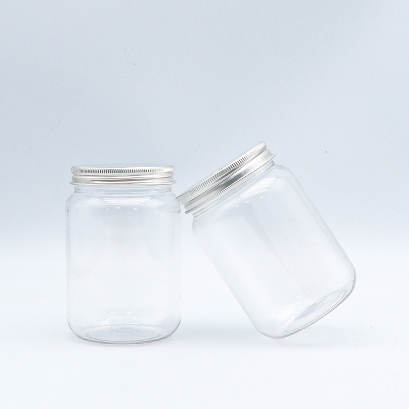
Choosing visible logo colors is more involved than just picking brighter colors. Choosing visible logo colors considers the colors of the logo materials and even environment the logo will be exposed to. When a logo is visible, it means the logo can be recognized without additional context, even on a clear PET bottle, a frosted jar, or a frosted pharma pack. Four such color attributes are color contrast, color saturation, and color-fit to the base material. Enough colors are available to create color combinations for logos printed on products like clear plastic bottles, without blending into the background or acronyms. Advanced professionals must master the color selection process, as it impacts color customer perception and brand recognition, far more than the color itself.
Every industry and type of product has their own color requirements in order to be visible, and this differs for the packaging world too. In the case of a logo on a food-grade juice bottle, the logo needs to have colors that go with the product, yet still stand out. A case study was a heart-shaped PET juice bottle where pink was the first logo color used. Unfortunately, the softer pinks lacked contrast to the transparency of the bottle and the amber color of the juice. The logo color was then changed to a bright coral with a white outline and the logo was now easily identifiable on the shelf with the coral standing out to the bottle and the juice color. In regard to pharmaceutical packaging, when visibility is even more weighted in trust, the colors of deep blue and green stand out on amber and white bottles and create a reliable trust that goes with the industry. With cosmetic packaging, the flushed metallic color and the deep green of the bottle is pleasing, but on the surface of the packaging, the softer colors are beautiful and also stand out.
Since visibility and emotional connection to a brand are affected by color psychology, research from experts here is pertinent. The Color Association of the United States found that in retail settings, a significant 78% increase in brand name recognition occurred when test subjects viewed logos in color combinations such as navy and yellow and black and cyan. This finding is especially important in packaging, because in a sea of competing products, brand visibility is critical. Additionally, SGS quality systems standards state that in products such as pharmaceuticals and pesticides, identifiable visibility of the product is essential for the safety of the customer. Experts suggest that light and pale hues like blue and purple, which are closely aligned, should be avoided because of the decrease in contrast the two shades provide, particularly when printed on a textured or transparent surface. When brands follow these guidelines, they are making a research based decision to ensure that their logos will be seen and their messages understood at a subconscious level by their customers.
Many brands trap themselves in ways that limit the visibility of their logos. One mistake is going for the trend instead of logos that are functional. While neon colors are trendy, these colors can clash with the colors of the product or fade on plastic packaging when exposed to sunlight. Another mistake is not testing the logos on different materials and in different settings. Even though a logo looks bold on a screen, the logo can get washed out on a PP matte juice cup or look worse on a bent spray bottle. Logos with too many colors can also be a problem. Research shows that logos with around two to three colors that are close to each other in the color wheel are a lot more visible than logos with a lot of different colors. These colors also make the glass bottle look more upscale
A brand’s visibility and identity should not be compromised by the other. Achieving the right logo color saturation does both. A market player known for sustainability with a logo that features earthy green and brown does the right thing by making the logo visible on recyclable plastic cans. The value of business increases when the logo is visible. The more visible the logo, the more the customers will remember it and the more sales the business will make. It is reported by packaging customers that recognizably packed products increase the likelihood of the customers making repeat purchases by 30% because they can easily spot and select the products they want. Customers appreciate sustainable packaging and psychologically, they will trust the details and quality of the product. Visibility and green values are a perfect match for cosmetics brands as well as for large and small beverage brands.