Years of experience in the packaging industry show that the first rules that need to be addressed in a logo color design are the packaging materials and the Printing technology that will be used. Different materials like PET, PP, and glass respond differently to ink. Adhesion is also different, at least in human visual perception. For example, adhesion to PET plastic and cosmetic containers is high with a water-based ink that is compliant with food packaging and is colored red or blue, in terms of visual perception through screen printing and hot stamping. For colored or frosted plastic containers, the use of highly opaque inks is advocated, whereas light or low-saturated inks are avoided to prevent logos from disappearing. Food-grade inks are used for packaging and printing. Ink with a lower than 1% VOC level meets FDA and SGS standards, ensuring the product is safe in terms of Embossing and foil stamping. Inadequate adherence to the ink also influences the logo’s color.
Colors used in packaging and logos play a big role in how different cultures accept products. In many cross-border packaging cases, businesses learn that they must adjust packaging to each culture's acceptance of different colors. In China and Japan, red is used to signify happiness and success, and is popular in food packaging. In contrast, red is seen as a color of warning/ danger in Western cultures and should be avoided. A number of countries in the Western world see green as a color that represents health and the environment, so food and medical products are widely packaged in green, In contrast, the Middle East has a few countries that view the color green negatively. There is a universal acceptance of the color blue as a positive and safe color. Therefore all countries will accept blue packaging of cosmetic and beverage products. The young consumer market where gradient color logos are common means that the color combination must fit the young consumers' preferences. A popular example of this is the combination of yellow and orange gradient that young consumers in the European and American markets love. It is also used in beverage packaging logos to create a fun and energetic brand image.
Before selecting a color to customize your logo on cross-border packaging, it’s imperative you study your target market’s culture well so that you don’t run the risk of a color clash, and to ensure that the overall branding message is communicated to your audience clearly.
In the food and pharmaceutical industries, packaging undergoes strict regulations, from the choice of colors in the logos to the selection of compliant materials, and the industry's bottom line is compliance. International standards governing the selection of materials and colors include ISO9001 and the EU Regulation 1935/2004. Core to the evaluation of compliance is test/inspection guides on color fastness, including water, friction, and light fastness, among others. For example, to safeguard the safety of food and medicine, packaging logos must have a water fastness rating (≥4) and a dry friction fastness rating (≥4) as well as a wet friction fastness rating (≥3). For medical packaging, including pill bottles, the colors of the logos should not be eye-catching, and the logos should be printed with ink that has been certified under the OH&S (Occupational Health and Safety) Management System (i.e., the ink does not contain lead or other hazardous materials that will migrate). The logos of food and medical packaging must meet the hazardous materials testing and migration standards set forth under the SGS quality system and the logo colors must undergo testing to ensure compliance with food and pharmaceutical packaging safety regulations.
Colors that do not meet compliance will result in market rejection for the product. Therefore, the selection of colors must adhere strictly to the Standards.
Brand images and recognition can be greatly impacted by the colors used in logos and the colors used in packaging and how colors are strategically used can be backed by data from multiple bespoke packaging winners in the industry. When trying to match colors to the 'positioning' of the brand and the 'attributes' of the product, example choices include; for luxury and prestige positioned cosmetics, 'soft matte' and 'low-saturation' colors like 'nude pink' and 'midnight blue' encapsulate and communicate that high-end and elegant brand image; and for food products aimed at kids, the packaging can use bright and 'happy' swimming sky blue and jolly bright yellow to attract the focused attention of kids and caregivers alike. A logo with one color is more 'recognizable' in the marketplace than logos with multiple colors, and this is particularly true for small perfume and cosmetic spray bottles. Too many colors can make the logo appear 'cluttered'. A great example is the single Green logo on the child-resistant round bottle of pharmaceuticals which is considered a strong visual brand identifier and it is easy to 'recognize' and 'remember' the brand.
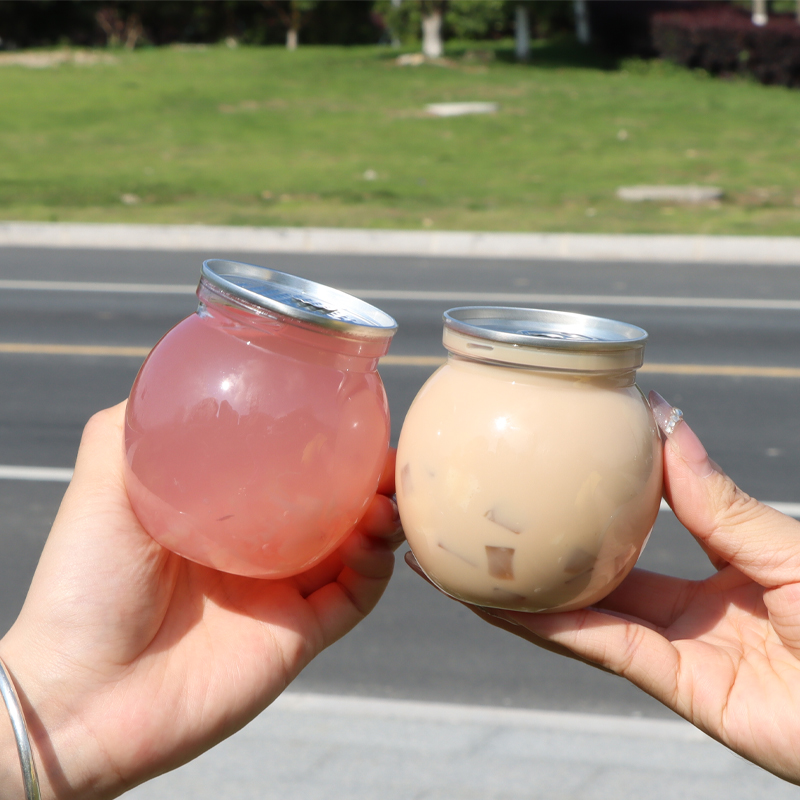
It is important to select contrasting colors for logos and packaging.For better visual effect and enhance the brand's exposure in the terminal market, the black logo on the transparent PET bottle and the white logo on the coloured plastic bottle are the optimal choices.
The last component of quality control of production and brand manual compliance is controlling the logo color consistency during mass production. In the production run, the Pantone color card is used for color matching. For mass production, the ΔE value range should be between 3.0 and 1.5. For high-end customized solutions, the ΔE value range should be between 1.5 and 1.0. A color difference meter is used during production for color matching and it is necessary to make adjustments for the color consistency of the logo throughout the production run. For overstocked, slow-moving popular items, the ink ratio is maintained constant to minimize color differences. Each production batch must be quality controlled and passes a color fastness and a color consistency test.